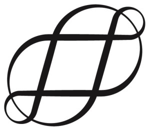
Perhaps typography doesn’t interest you, but my associations with letter press printers, those odd creatures who print by taking the individual letters and putting them together into rows of type, running ink over them and creating art, has led me to enjoy and respect typographic oddities. Which brings me to the interrobang. You can find the detailed history of this mark–the only new punctuation mark of the 20th century–in a book called Shady Characters. You can get a taste of it here.
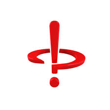
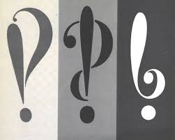
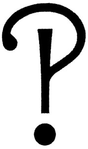
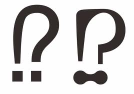
Designed to express both incredulity and overwhelming confusion of the modern age, the interrobang is both an exclamation and a question mark. Here are a few samples:
Unfortunately, the interrobang never made it to a permanent place on the keyboard, and despite its elegant look, isn’t even part of any standard font set.
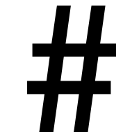 As for the octothorpe, on the other hand, lives on keyboards and in standard fonts, and has found a home on Twitter as the hashtag. The octothorpe, too, has some elegant designs:
 And did you know that the backwards P that editors use to designate a new paragraph is called the pilcrow? I didn’t.
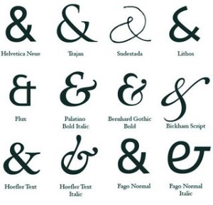
Let’s not even start on the many elegant permutations of the ampersand. We’d be here all day.
